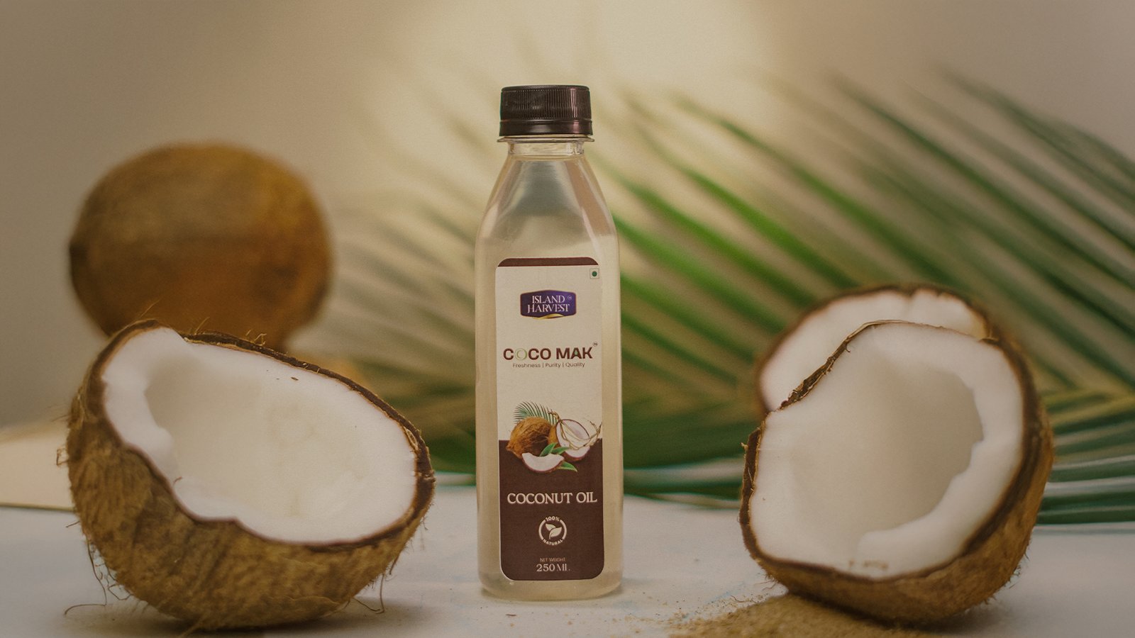
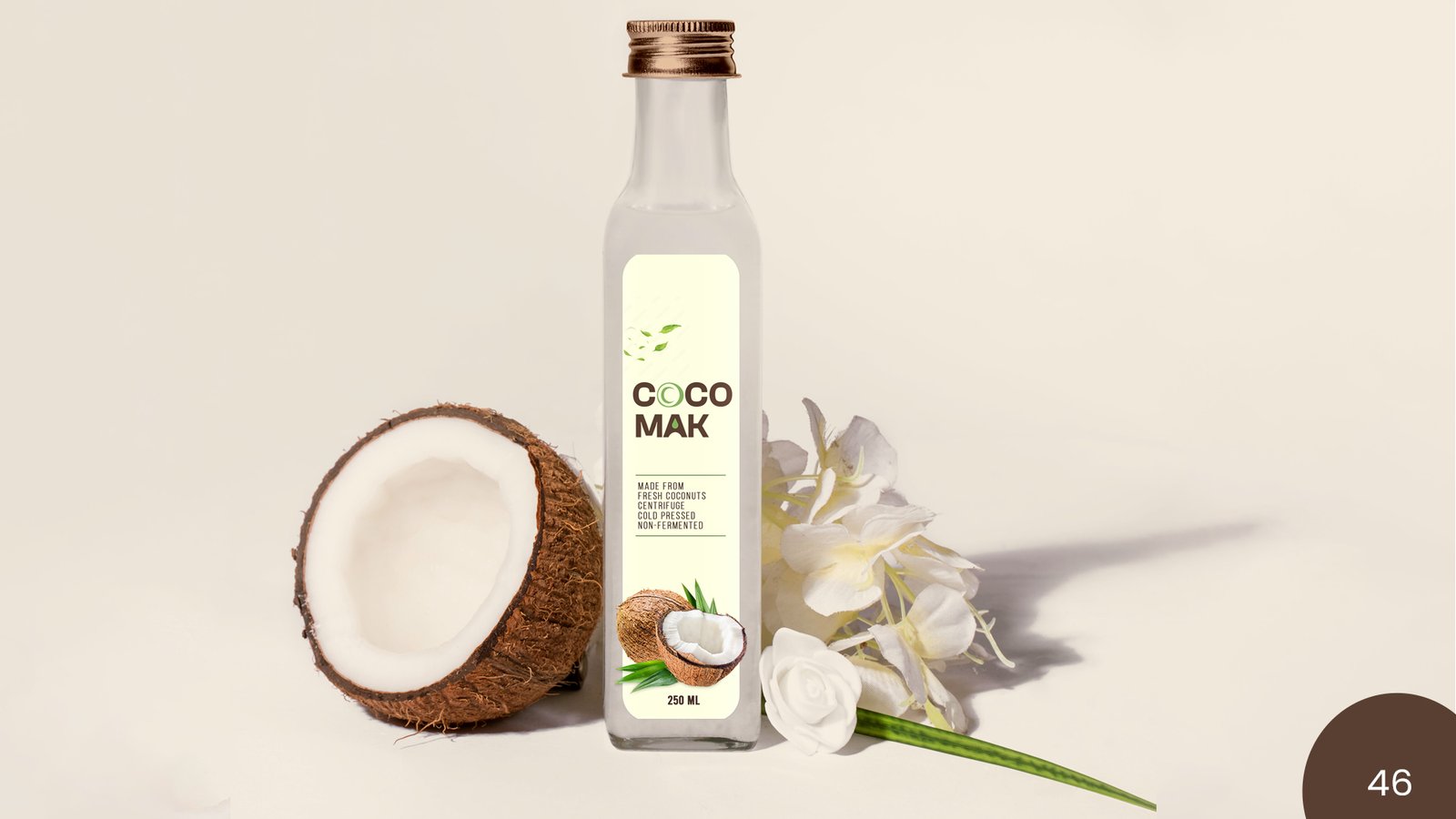
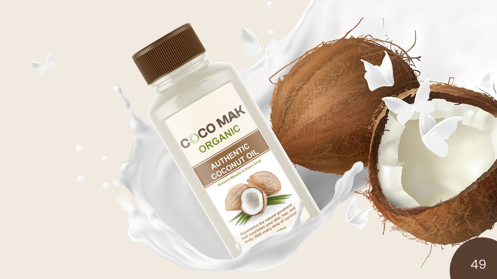
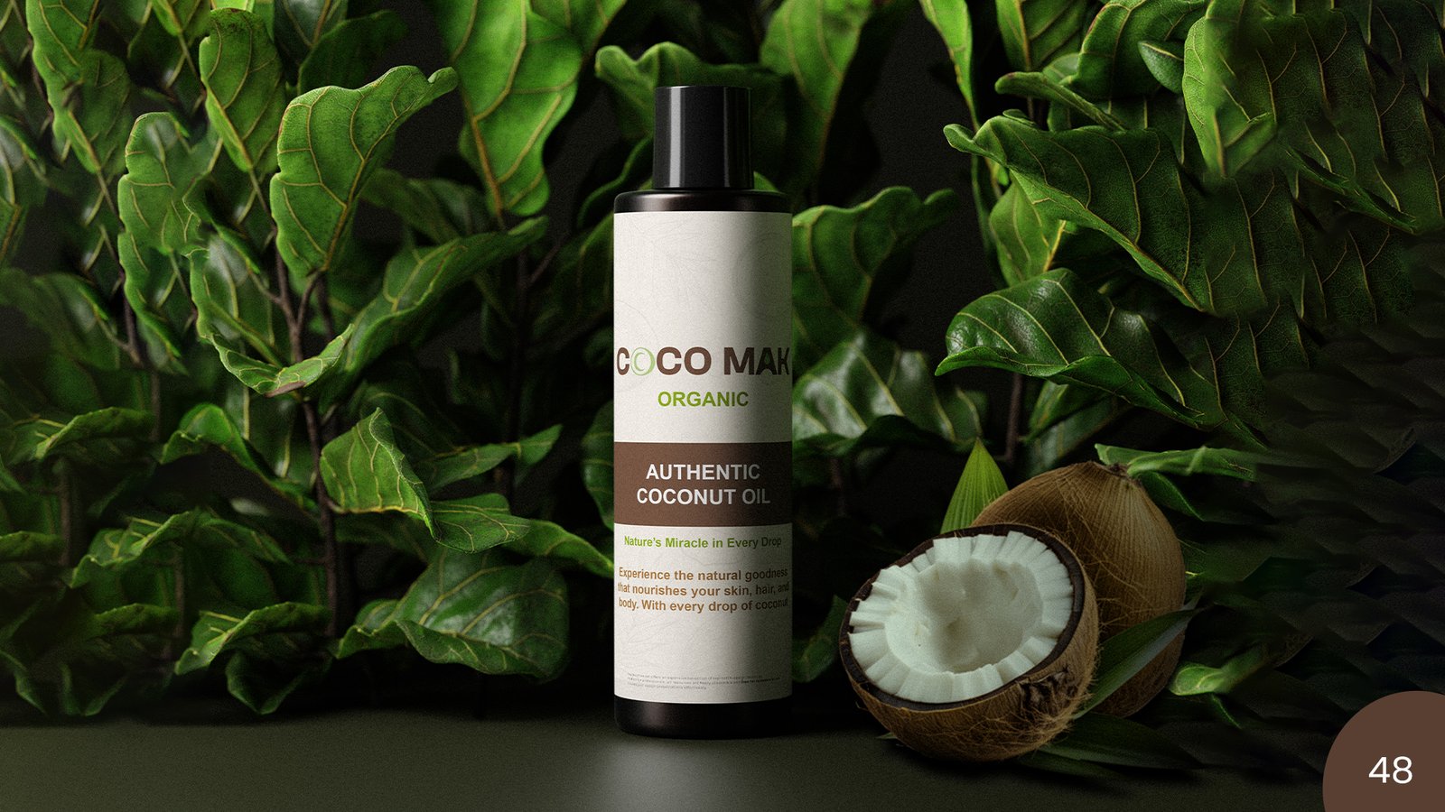
Coco Mak is a pure coconut oil brand built on the values of purity, sustainability and wellness. Sourced from natural origins and processed with care, the brand appeals to consumers who seek clean, multipurpose products for cooking, skin and hair. Coco Mak stands for authenticity and simplicity, offering premium quality in a market flooded with artificial blends. Committed to eco-friendly practices, Coco Mak also prioritizes responsible sourcing and packaging to support a healthier planet.
-
TypographyClash Grotesk Semibold
-
Color palette
- hex #599f91
- hex #f9f1e4
- hex red
What We Did
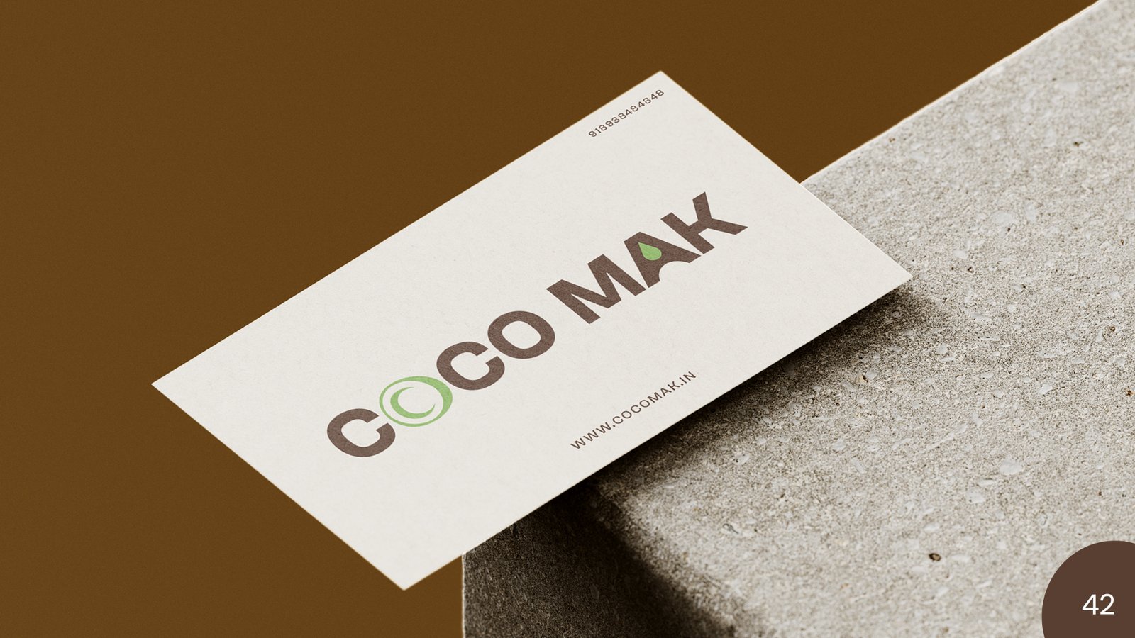
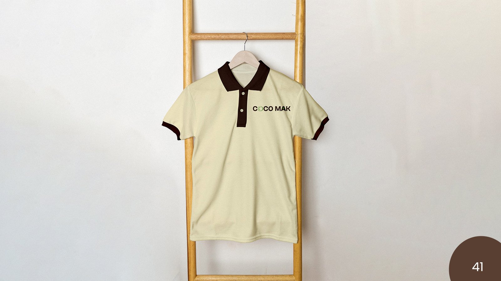
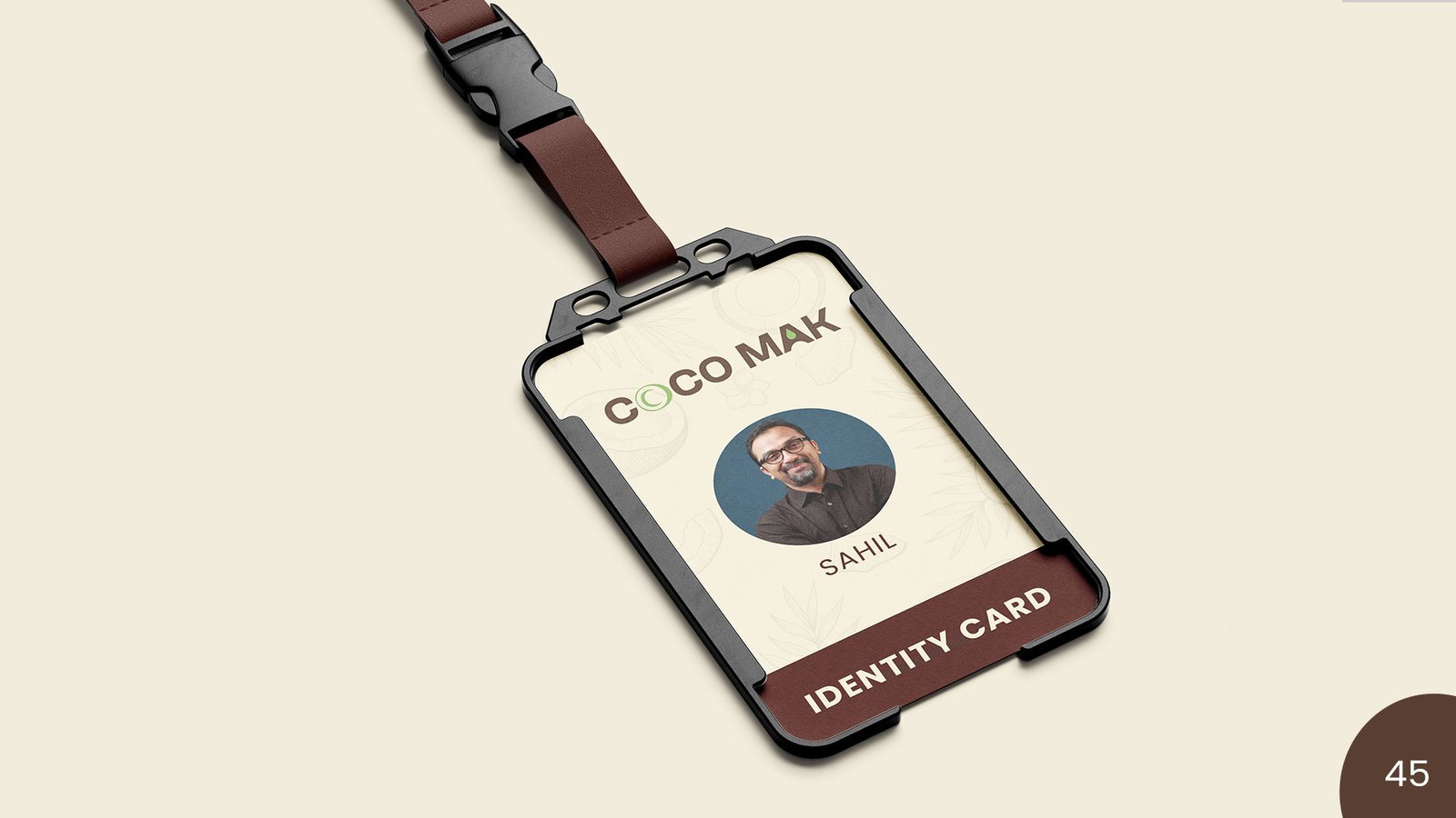
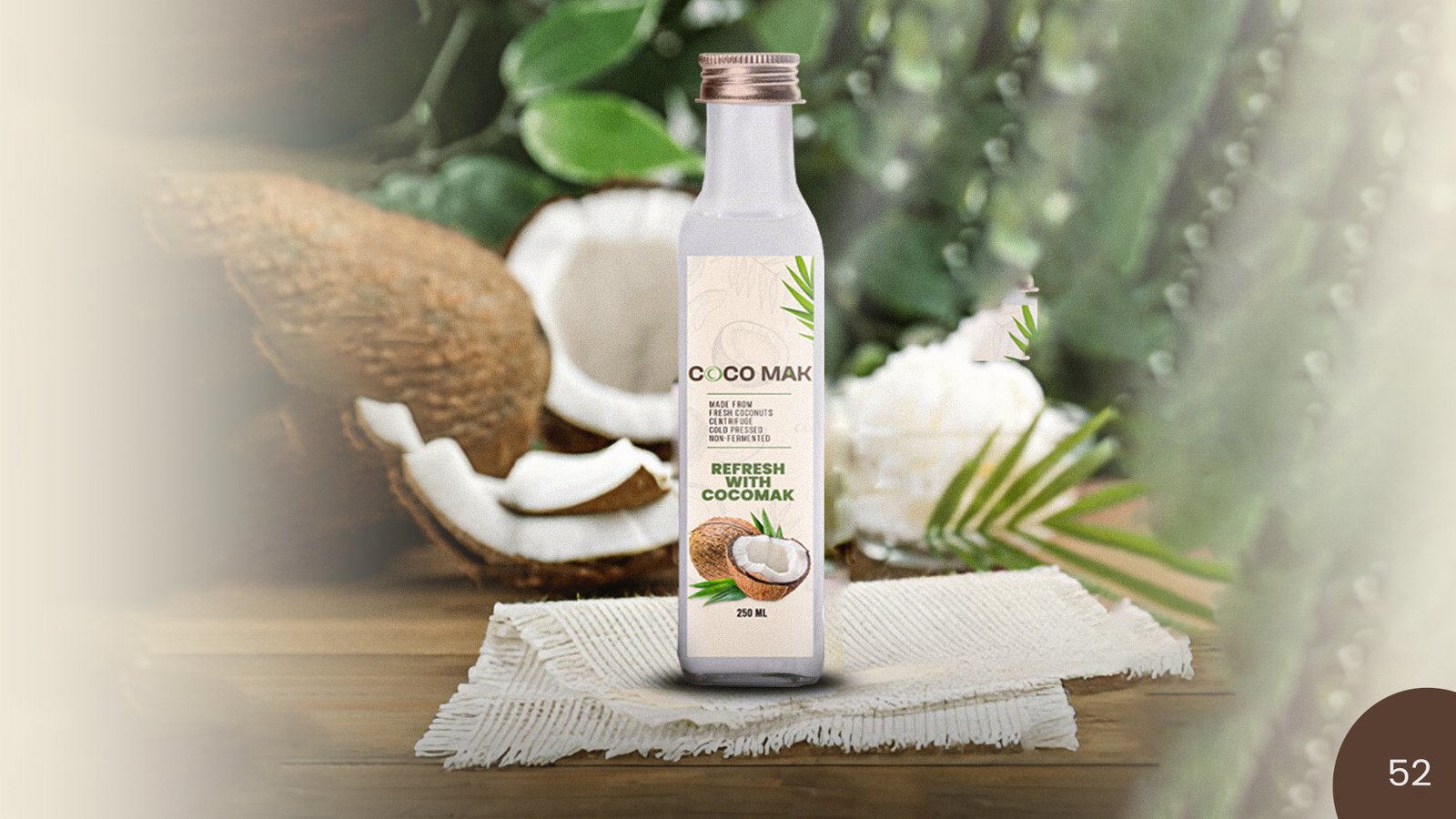
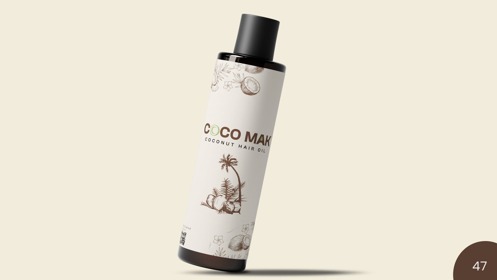
We created a complete brand identity for Coco Mak that reflects its natural and trustworthy essence. The logo was designed to feel clean and organic, featuring a subtle drip of oil integrated into the letter “A” to visually showcase the product’s purity and richness. The brand strategy and guidelines focused on visual clarity, product purity, and shelf appeal. The outcome was a fresh and professional identity that positioned Coco Mak as a high-quality, all-natural coconut oil brand ready for both local and global markets. This thoughtful design detail helps convey the brand’s commitment to authenticity and the natural benefits of its product at a glance.
Discover
More works

Branding for
Trade Trails