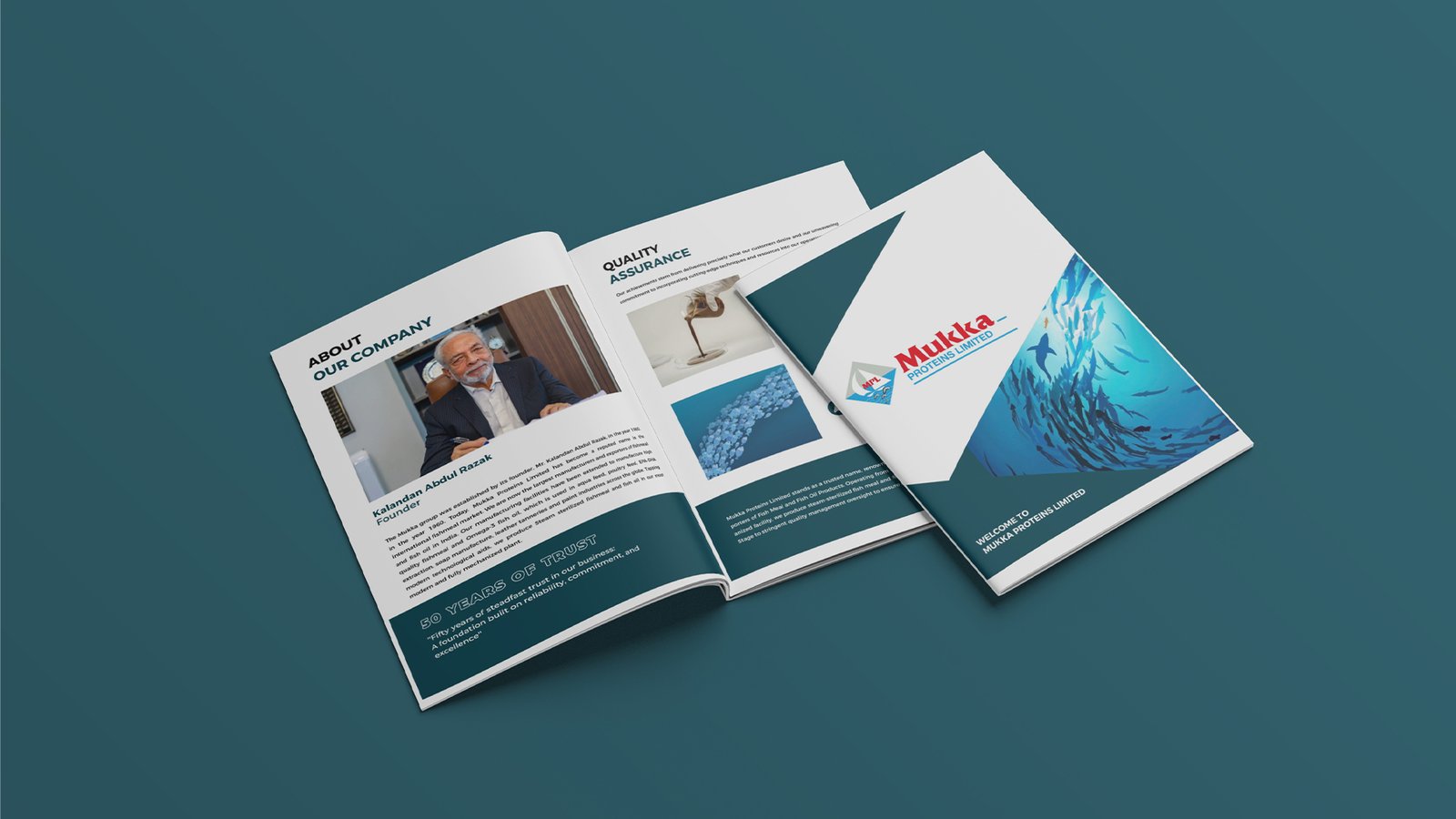
Bangalore Agro Protein is a leading manufacturer and supplier of high-quality agro-based protein products used primarily in animal feed and agricultural industries. With a focus on sustainability, nutritional excellence, and consistent supply, the brand plays a vital role in the agricultural supply chain. As the industry moves towards more standardized and value-driven partnerships, Bangalore Agro Protein aimed to build a strong and trustworthy brand identity to support its expansion goals.
-
TypographyOutfit Bold
-
Color palette
- hex #265e44
- hex #96c15c
The Insight
Bangalore Agro Protein, a key player in the agricultural supply chain, wanted to evolve from being seen purely as a supplier to becoming a trusted partner in sustainable and value-driven farming. With the industry moving towards higher standards and long-term partnerships, the brand needed an identity that reflected its focus on quality, consistency, and responsible practices.


What We Did
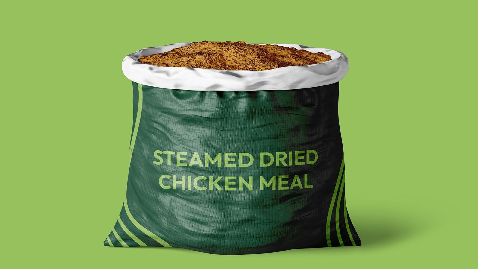
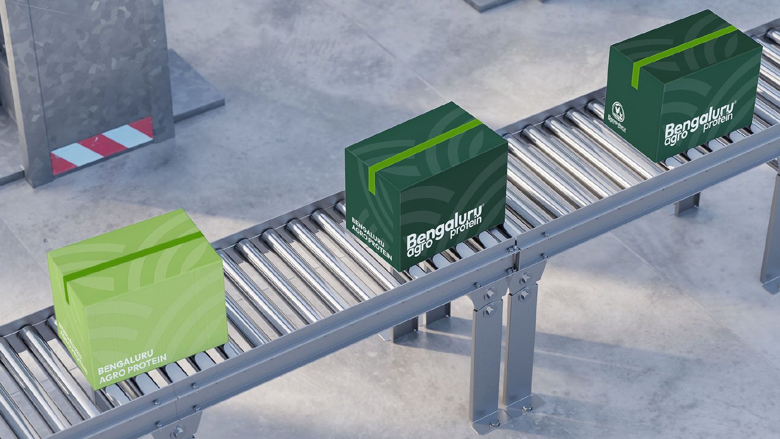
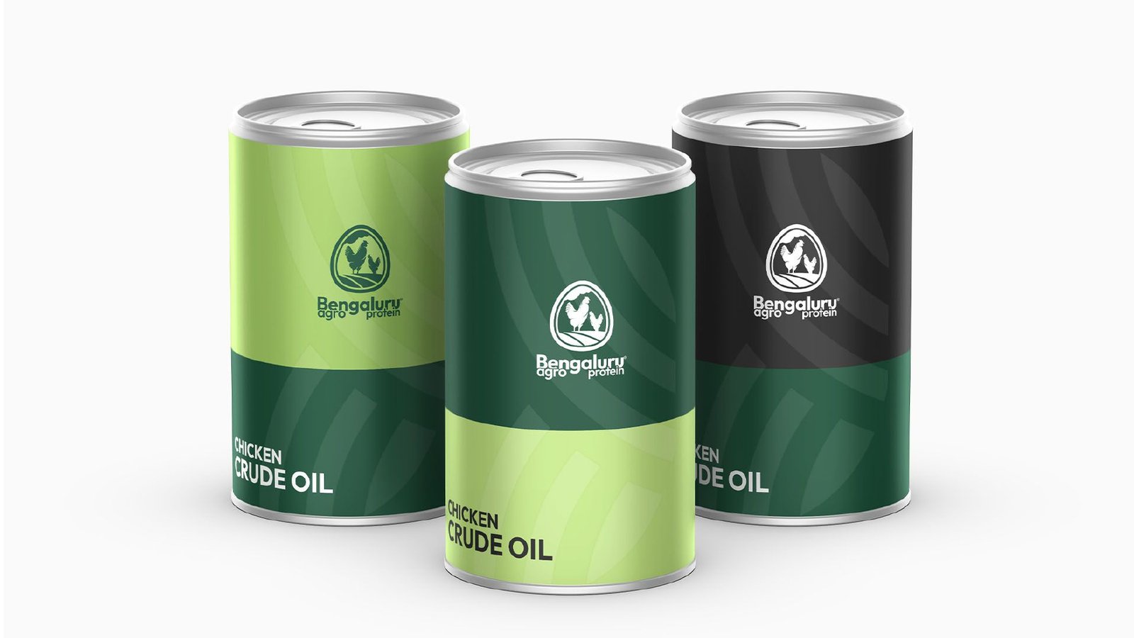
For Bangalore Agro Protein, we developed a comprehensive branding system to reflect its credibility, reliability, and agricultural expertise. Starting with a clear brand strategy, we defined their core values, target audience, positioning, and messaging approach centered on trust, quality, and long-term value.
The logo was crafted to combine elements of nature, growth, and industrial strength, representing both the organic roots and production efficiency of the business. We then created a detailed brand book and guidelines, covering typography, color schemes, packaging considerations, documentation templates, and tone of voice for B2B communication.
The result was a professional and cohesive identity that gave Bangalore Agro Protein a competitive edge in both domestic and export markets, enhancing recognition and establishing a platform for continued business growth.

Discover